Status Page Examples and Best Practices
TL;DR
The best status pages share six traits: real-time updates, component-level breakdown, incident history, uptime metrics, clear design, and a subscription option. GitHub, Stripe, and Cloudflare each do at least one of these exceptionally well - their approaches are worth studying before building your own.
What Makes a Great Status Page?
The difference between a status page that users actually check and one they ignore comes down to a few concrete things. After reviewing dozens of status pages from SaaS companies, infrastructure providers, and developer tools, these are the traits that separate the useful ones from the decorative ones.
- Real-time updates: A status page should reflect the current state of your services, not yesterday’s. If there is an active incident, users need to see it the moment they load the page. Stale data destroys trust faster than downtime itself.
- Component breakdown: Showing a single green checkmark for your entire platform is not enough. Users want to know if the API is up, if the dashboard is working, and if webhooks are firing individually. Component-level status helps users self-diagnose whether an issue is on your end or theirs.
- Incident history: Past incidents with timelines and resolutions show users that you take reliability seriously. A detailed incident history also helps your own team spot patterns and prevent repeat failures.
- Uptime metrics: Displaying historical uptime percentages gives users a quick read on your overall reliability. It also holds your team accountable to a visible standard.
- Clear design: A status page needs to be easy to scan, especially on mobile. During an outage, users are often checking from their phone. Dense tables and cluttered layouts slow people down when they need answers fast.
- Subscription option: Let users subscribe to updates via email, SMS, or webhook. Proactive notifications are far better than forcing users to refresh a page every five minutes during an incident.

If you are starting from scratch, our guide to setting up status pages covers the full process step by step. The examples below will show you what good looks like in practice.
10 Status Page Examples Worth Studying
Each example below does at least one thing particularly well. Some nail the component breakdown. Others stand out for incident communication or geographic detail.
Real status pages
10 status pages worth studying
Each takes a different approach to the same problem: telling users honestly what is and is not working right now.
Screenshots reflect each page at the time of capture. Click through to see the live version.
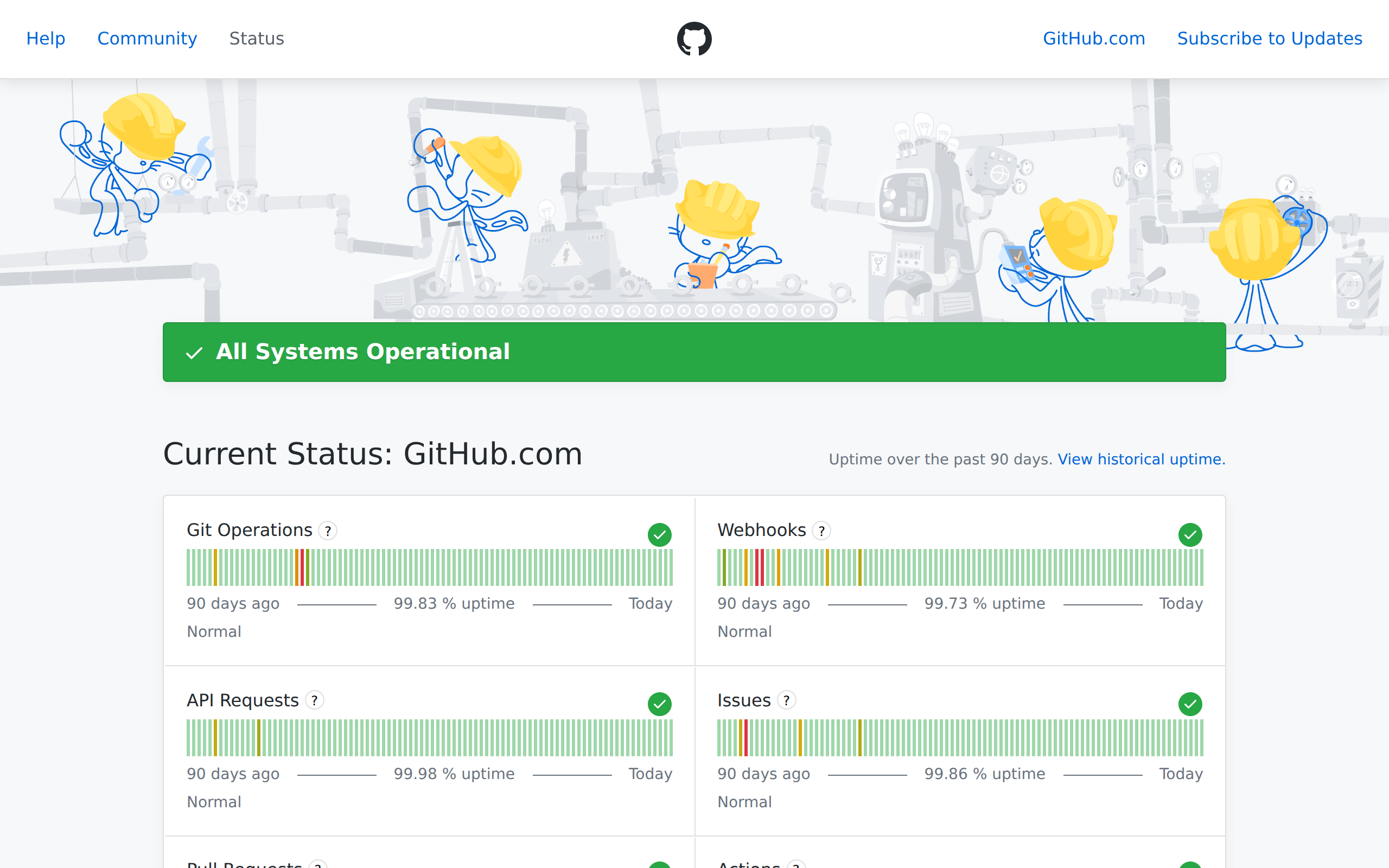
1. GitHub
githubstatus.com - GitHub’s status page is a masterclass in clarity. Each major service (Git Operations, API Requests, Actions, Codespaces, and more) gets its own row with a clear indicator. Their incident history is particularly strong, with detailed timelines showing exactly when an issue was identified, investigated, and resolved. For a platform that millions of developers depend on daily, this level of transparency is essential.
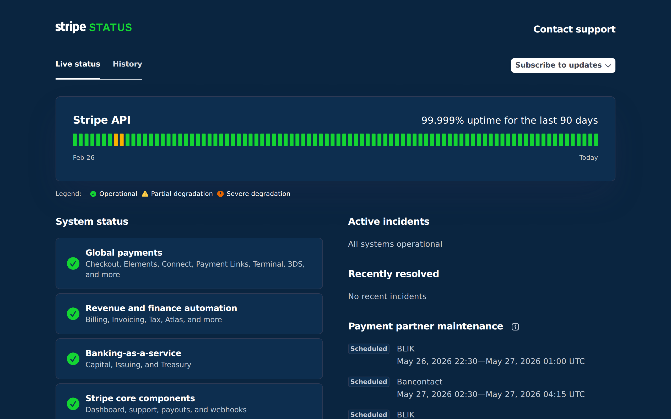
2. Stripe
status.stripe.com - Stripe’s status page is built for developers who need to know exactly which API endpoints are affected. It breaks down status by product area (Payments, Payouts, Dashboard, Connect) so you can quickly see if your integration is impacted. The subscription option lets you get notified by email or webhook, which is critical when your revenue depends on their API.
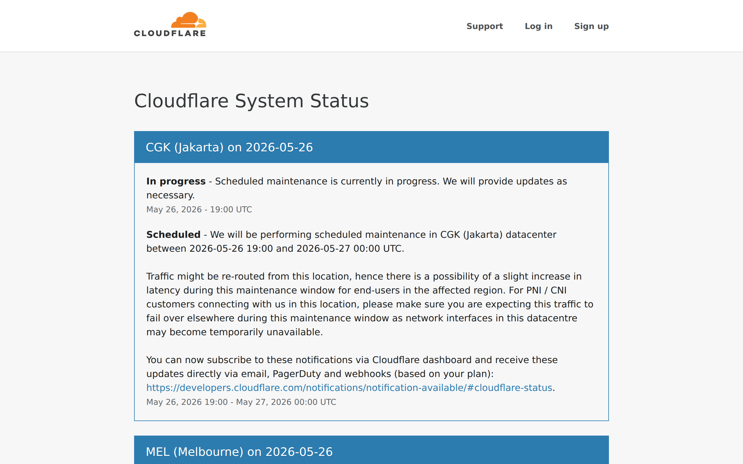
3. Cloudflare
cloudflarestatus.com - Cloudflare operates a global network with over 300 locations, and their status page reflects that with regional breakdowns. You can see real-time performance data for specific regions, which is invaluable when diagnosing whether an issue is local or global. The level of geographic detail sets it apart from most status pages.
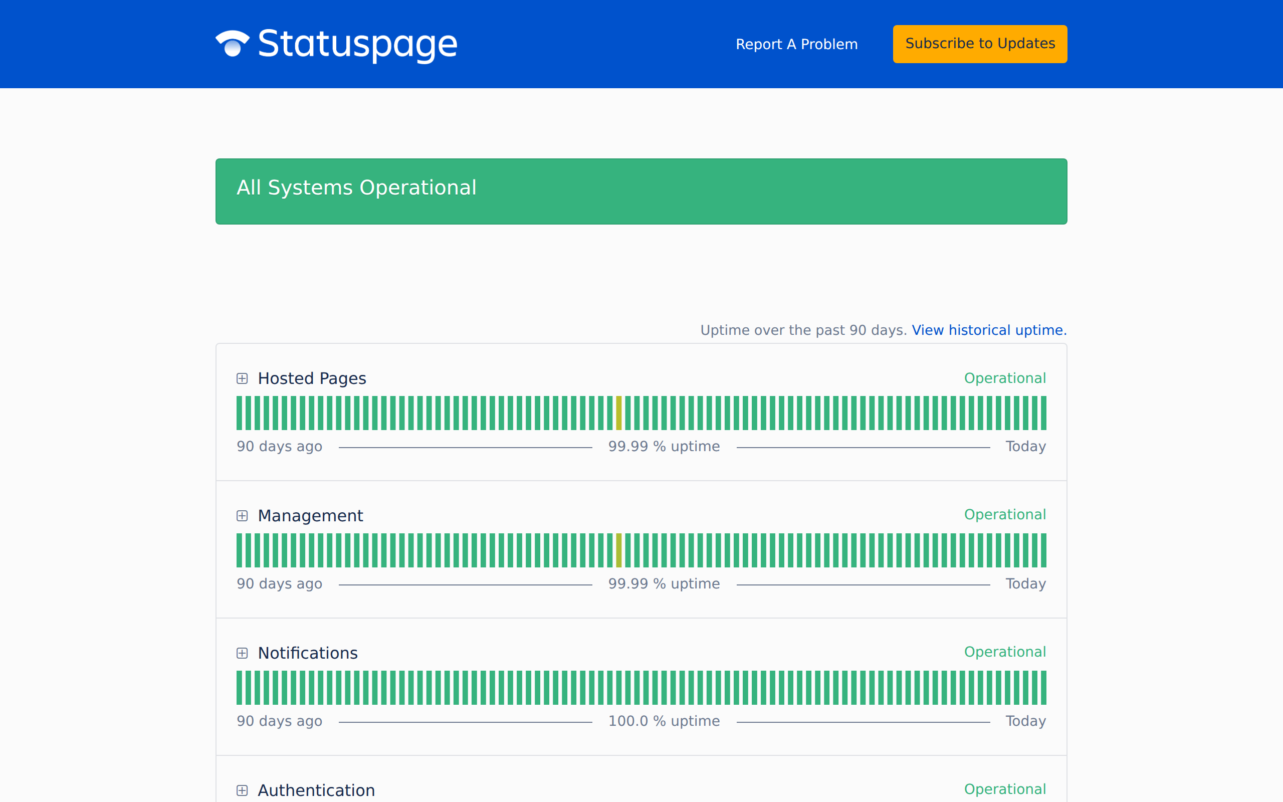
4. Atlassian Statuspage
metastatuspage.com - Atlassian literally built the tool that thousands of companies use for their own status pages. They eat their own dogfood well with a clean layout, component-level status, and thorough incident tracking. It is a useful reference because the format has become an industry standard.
5. Vercel
vercel-status.com - Vercel keeps things developer-friendly with a minimal, no-nonsense design. Components like Deployments, Serverless Functions, Edge Network, and DNS each get their own status indicator. The simplicity is the point. When your deployment pipeline is down, you need answers immediately, not a cluttered dashboard.
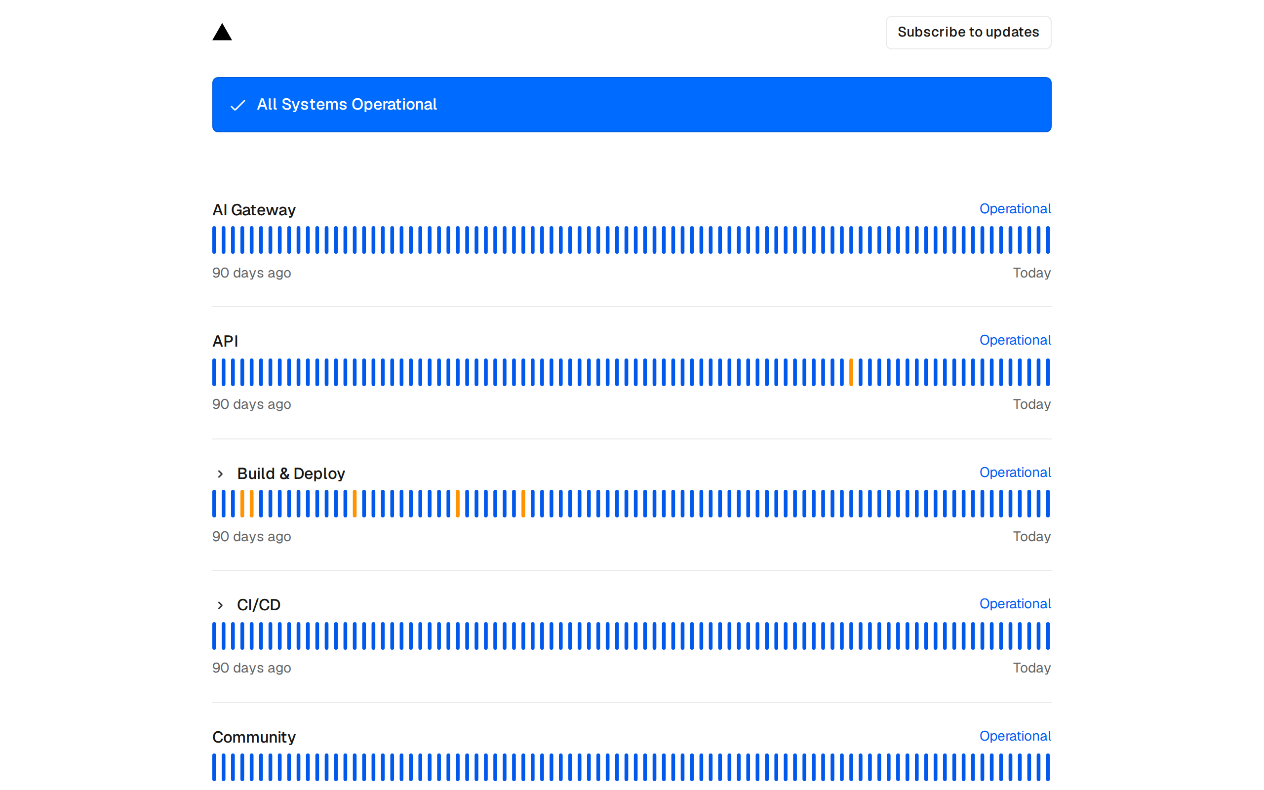
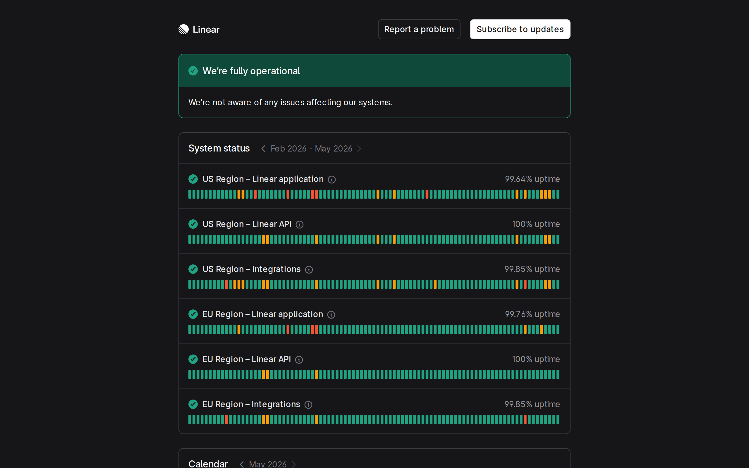
6. Linear
linearstatus.com - Linear’s status page matches the product itself: simple, fast, and focused. There is no visual clutter. You get a clear view of service health, recent incidents, and uptime history. It proves that a status page does not need to be complex to be effective. Sometimes showing exactly what matters and nothing else is the best approach.
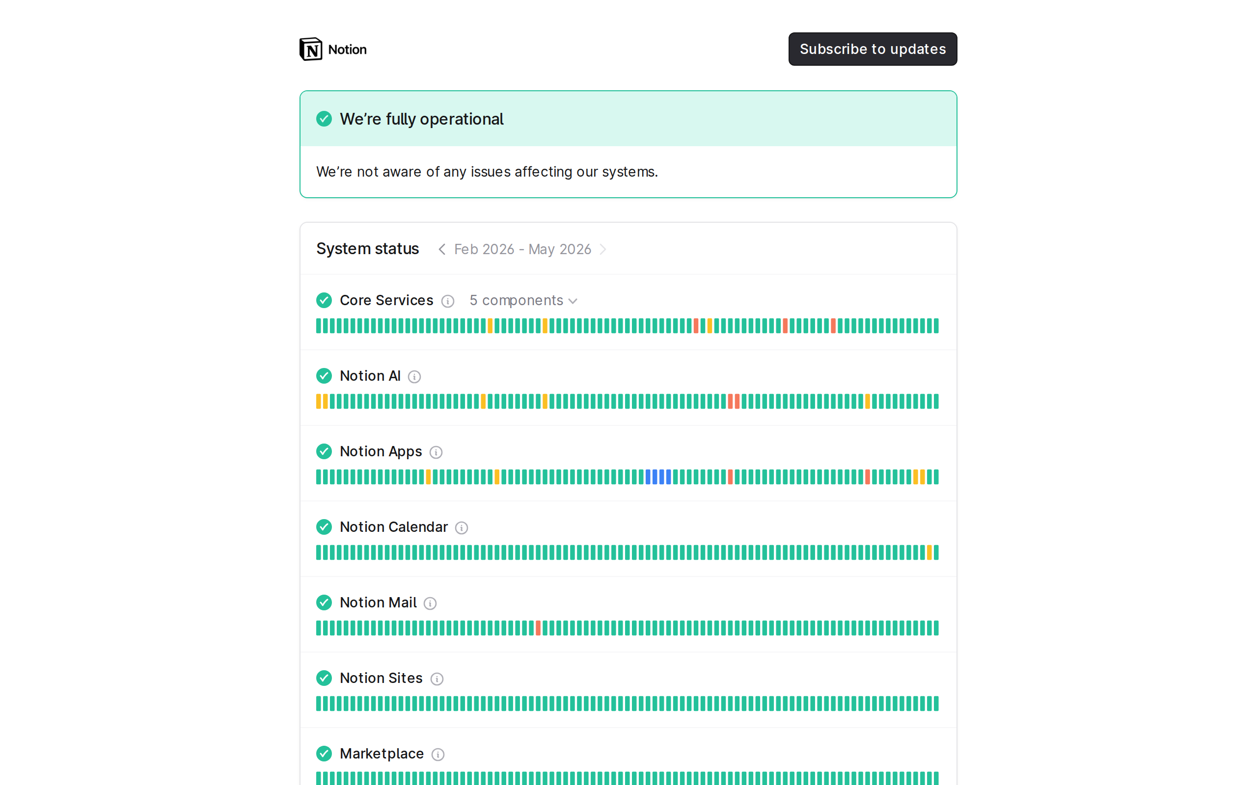
7. Notion
status.notion.so - Notion’s status page features a clean uptime chart that gives you a 90-day visual snapshot of reliability at a glance. The incident timeline is well-structured, with clear labels for investigating, identified, monitoring, and resolved stages. It communicates a lot of information without feeling overwhelming.
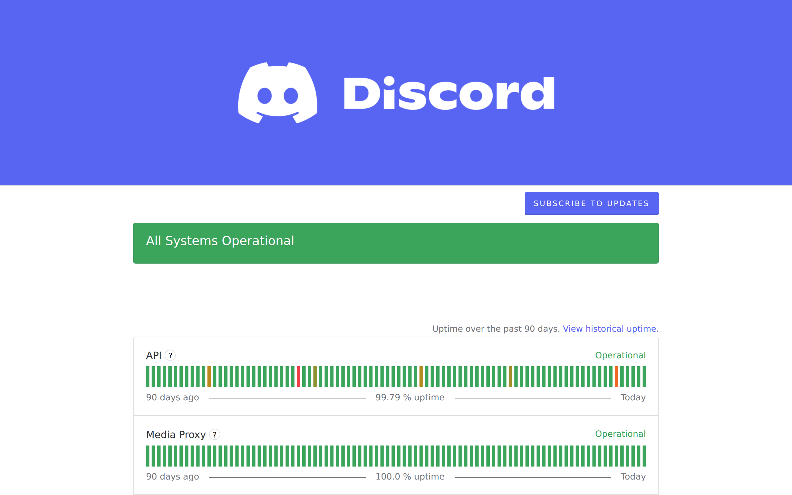
8. Discord
discordstatus.com - Discord serves hundreds of millions of users, and their status page handles that scale well. Components like Voice, API, Media Proxy, and Push Notifications each have independent status. Their incident communication is consistently clear, with regular updates during outages that keep users informed without overpromising on resolution times.
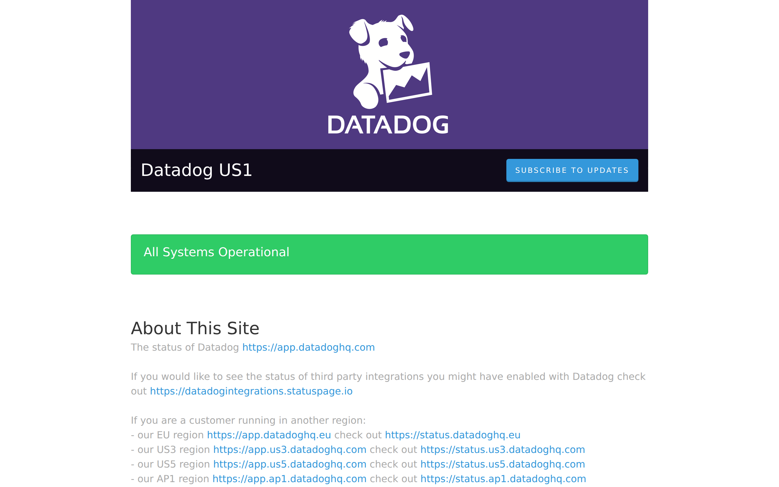
9. Datadog
status.datadoghq.com - As a monitoring company, Datadog sets a high bar for their own status page. It features per-region status views across US, EU, and other data center locations. Each product area (Metrics, Logs, APM, Synthetics) gets individual status tracking. If you are building a status page for a multi-region service, Datadog is a strong reference.
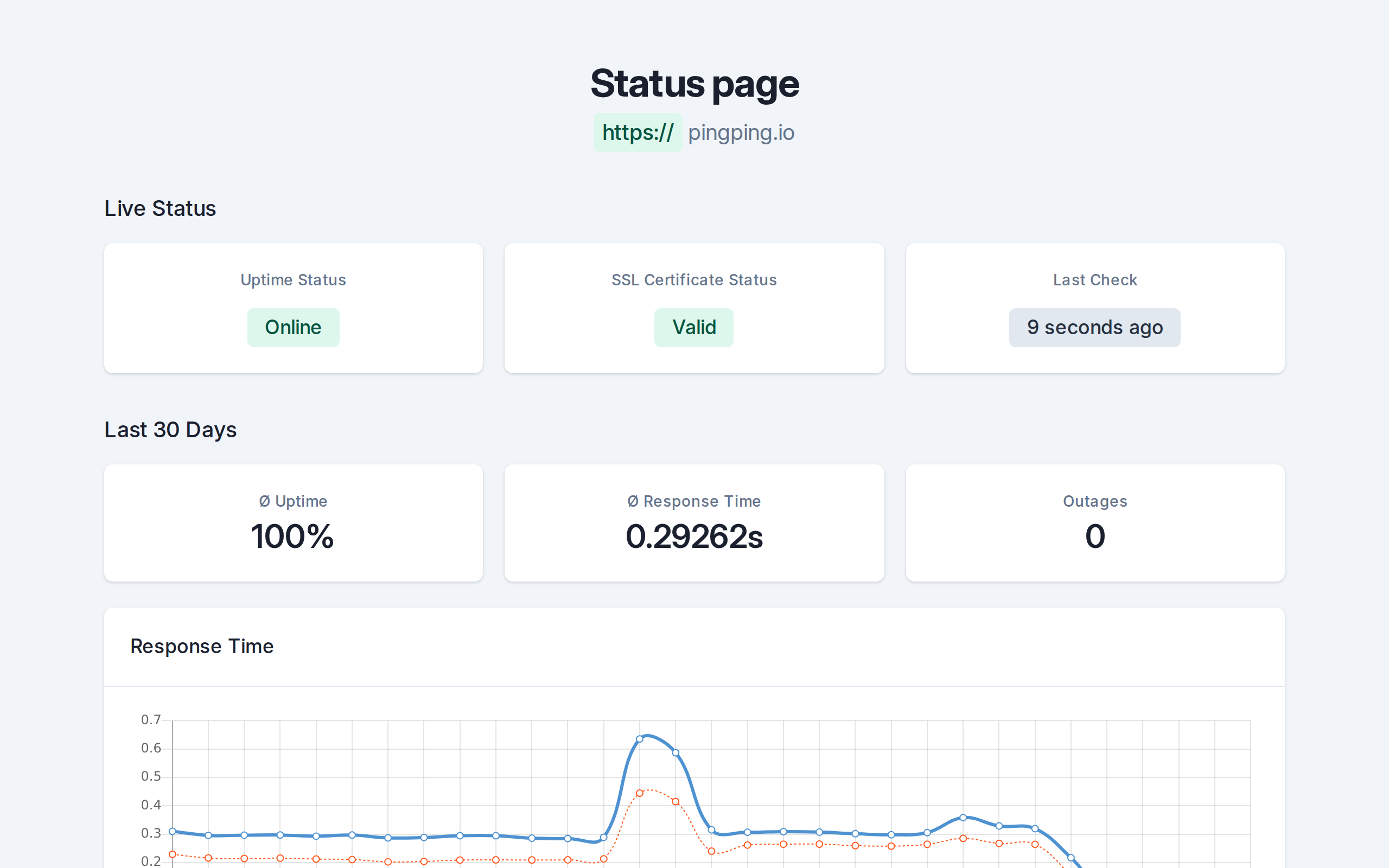
10. PingPing Status Pages
PingPing includes built-in status pages that update automatically from your monitoring data. There is nothing to configure manually. When your 30-second checks detect an issue, the status page reflects it immediately. You get custom domain support, a clean minimal design, and zero maintenance overhead. It is the fastest way to go from no status page to a professional one that your users can rely on.
Status Page Styles: Minimal vs Detailed
Looking at these examples, you will notice two broad approaches to status page design. Some companies keep it minimal with a list of components, each showing up or down, with a brief incident log. Linear and Vercel lean this way. Others go deep, showing historical graphs, response time data, regional breakdowns, and detailed incident post-mortems. Cloudflare and Datadog are examples of the detailed approach.

Neither style is universally better. The right choice depends on your audience. If your users are developers integrating with your API, they probably want more detail, such as which endpoints are affected, what error codes they might see, and estimated resolution times. If your users are non-technical, a simpler page with a clear green/yellow/red indicator and a plain-language explanation of any issues is more helpful.
The one thing both approaches share: honesty. A minimal status page that accurately reflects your service state is infinitely more valuable than a detailed one that is out of date or sugar-coated. Your users will forgive downtime. They will not forgive dishonesty about it.
Essential Elements Every Status Page Needs
Regardless of whether you go minimal or detailed, every status page should include these core elements:
- Overall system status: A single, at-a-glance indicator (green, yellow, or red) that tells users whether things are working. This is the first thing people look for.
- Individual component status: Break your service into logical components (API, web app, database, CDN) and show the health of each one separately.
- Active incident information: If something is wrong right now, it should be front and center with a description of the issue and what your team is doing about it.
- Historical uptime data: Show uptime percentages or a visual timeline over the past 30, 60, or 90 days. This builds long-term confidence in your reliability.
- Subscription for updates: Give users a way to subscribe via email, SMS, or webhook so they do not have to keep checking the page manually.
- Link back to your main site: Status pages are often hosted on a subdomain. Always include a clear link back to your main product so users can navigate easily.

Common Status Page Mistakes
A bad status page can be worse than no status page at all. Here are the most common mistakes that undermine trust:
- Not updating during incidents: If your status page still shows green while users are experiencing errors, you lose credibility instantly. This is the single most damaging mistake. Automated monitoring that feeds directly into your status page eliminates this problem.

- Showing “all systems operational” during known issues: Closely related to the above, but worth calling out separately. Users who see this while experiencing problems will never trust your status page again. The cost of downtime goes up when users feel deceived on top of inconvenienced.
- No incident history: A status page that only shows current status with no historical record misses half the point. Users and potential customers want to see how you have handled past issues.
- Not linking to it from your main site: If users cannot find your status page, it might as well not exist. Add a link in your footer, your documentation, and your support pages.
- Making it hard to find: Use a predictable URL like status.yourdomain.com. When users are frustrated by an outage, they should not have to hunt for your status page.
Setting Up Your Own Status Page
You do not need to build a status page from scratch or pay for an expensive standalone tool. PingPing includes status pages as a built-in feature that connects directly to your monitoring data. When your 30-second checks detect a problem, the status page updates automatically with no manual intervention required.

You get a clean, professional page with custom domain support, component-level status, and incident history. All powered by the same uptime monitoring that alerts you when something goes wrong. No separate configuration, no keeping two systems in sync.
For a full walkthrough of how to get your status page live, check out our guide to setting up status pages. You can have one running in minutes, and your users will thank you the next time something goes sideways.
Never miss an expiry
Built-in status pages on every plan. See how PingPing compares to UptimeRobot, Pingdom, and Better Stack.
Related guides
Setting up status pages
The full step-by-step walkthrough for building a public status page from scratch.
What is uptime monitoring?
The data your status page should be reading from, and why 30-second checks matter.
Uptime SLA explained
What 99.9 percent actually means, and how status pages prove you hit your number.